Wednesday, November 30, 2011

re up ac contact page


lighter, brighter

light yellowish background or white

re-up on ac page


lighter colors, changed color of logo

the blank middle is just an image holder

light yellowish background or classic white

Monday, November 28, 2011

AC CONTACT PAGE

i like the look of this page maybe keep the wood consistancy through out all pages, excetpt for the splash page. info wasn't given so i could place it, but this is a general look for it. the mid wood section would only be in the contact page though.

Sunday, November 27, 2011

profile redo

profile page, plain text, as is. click home to go back home, above categories.

tables,chairs etc, will have a main picture and the images to the right will have outline roll over. when clickin on the image it will gwt bigger to see more detail. same will apply for all

RE-DO AC SPLASH PAGE

what changed-

centerd text

smaller font

name of company centered

logo adjusted 

Wednesday, November 23, 2011

AC-Profile Page

i dont know how to make this less block like, but i could round off the squares in dream weaver... i hope


this was drafted up in illustrator, as well as the splash page. simple profile page, pic. I wish he would have smile in this pic, i didnt like the other, hes too cropped out in that picture.I though about cropping the head, but it would have looked kinda creepy.

AC SPLASH PAGE

the cabinet will actually be black and white, and when u scroll on it, it will become color. i loved the idea from the site i used for inspiration, and also reminds me of what i did whit my color website with the pumpkins. the home page will come up when u click on the profile page.

i want the wood sides to stay throughout the entire website.I choose black, gray and white  for a more masculine look. The image in the middle  flows wells as it so happens to match the colors of the splash page. The wood columns match the middle image.I put the wood column after i chose from the selected images. Out of the images, i though this one best showed a home ambiance instead of a lonely chair that would have taken longer to photo shop and position.


the logo was AC as suggested.I dont know if i want to keep it, the rough is a draft.The ;logo doesn't look horrible, perhaps i should lighten it, so it would match the other text.

AC LOGO

Wednesday, November 16, 2011

roll-over-list

this is only half done, the text is suppose to go across the grey

Monday, November 7, 2011

the how

index- the color orange- large image was a royalty-free image cropped, and i added text and small pumpkins in Photoshop.I wanted all the color to flow on the page to have a color theme.The previous splash page was horrible and needed to go far far away from the website universe.

the buttons-i used the same font and same pumpkin image and out together again in Photoshop, cropped it and placed it into the site. Each page had a reoccurring theme of small images that include the ingredients of each item being talked about, including the home page

the headings- each heading is based on the same design except for the pumpkin bread page, because it was done at school, and the other images were redone at home.i did not have the files nor the time to change it up. i spent quite some time on the pumpkin bread page, i like the way it looks

the bread page-the images are step by step of how i mixed the batter, all the supplies and there is also a link on the prep time and and how to mix wet and dry batter togther.

the jack page- pumpkin roll over were added because my original page looked like crap and wasn't very well planned out while i was designing it. there is also instructions on how to make one and a link when you click the 3 images that are together.

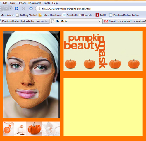
the mask page-this is the last page, simple, clean, one roll over. and the roll over leads back to the home page once it is clicked on. all images cropped and Photoshopped to have an orange hue in it. i wanted all images to have an orange hue in it

.com is ready for public view

http://www.mandocalrissian.com/index.html


the color orange is finally ready to view, updated splash page, rollovers added, images clicking back to home page, recipe links, but the use of the back arrow is necessary through out the website.

p.s. on bread page, i took all those images myself, made the pumpkin bread from scratch, and brought the bread to class.The class gave great reviews and the food. thanks class :)

-jack-o-lantern-page

had to change up the design a bit from the original

rollover the pumpkin in the images, turn to jack o lantern faces

Saturday, November 5, 2011

-mask page-

rollover on the face, turns into pumpkins- i will upload this @ school, its going to look like this

Thursday, November 3, 2011

-the pumpkin bread page-

this took sometime to do. there is a recipe link in the text

-web site almost done-

this is page one (the splash page)

and the new splash page has roll over. (it needed an up grade)